YiApp e-commerce of clothing and accessories
Tipo de Proyecto
Mobile App - This design is a multi-brand and multi-delivery online clothing store application for the general public.
Mi Rol
UI/UX Designer
Contribución
UI/UX Design, Prototipado, Investigación de usuarios
Línea de Tiempo
January 2023 - April 2023

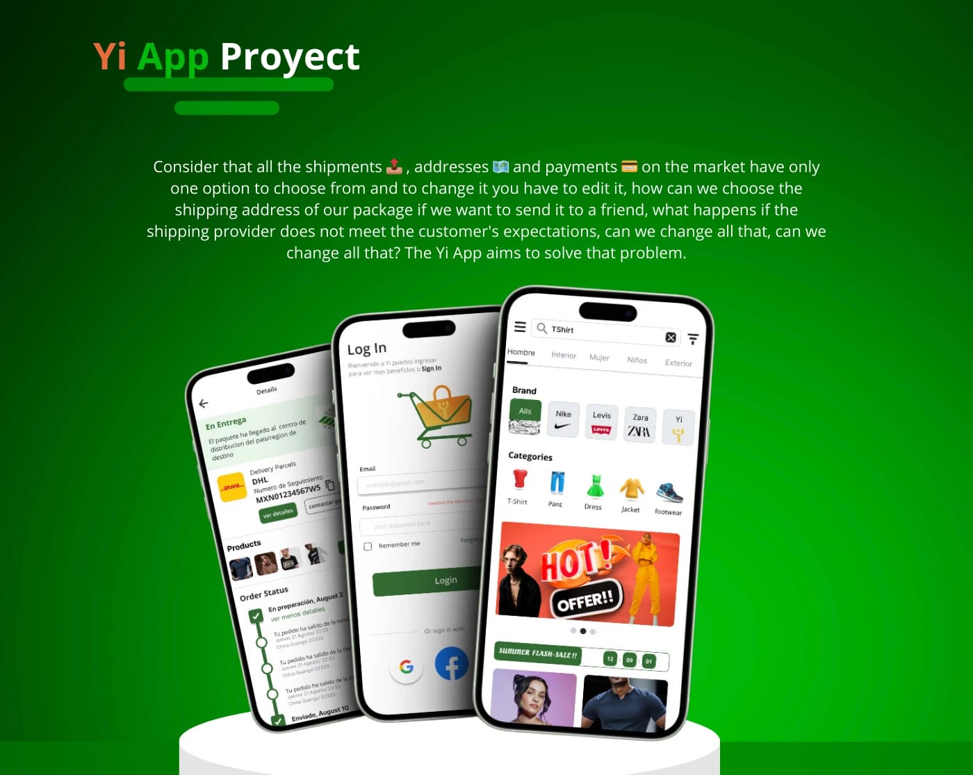
YiApp es una aplicación móvil de comercio electrónico especializada en ropa y accesorios. La plataforma ofrece una experiencia de compra intuitiva y segura, permitiendo a los usuarios explorar una amplia variedad de productos, realizar compras rápidas y gestionar sus pedidos de manera eficiente. Con un diseño atractivo y funcionalidades avanzadas, YiApp se posiciona como una opción ideal para los amantes de la moda que buscan conveniencia y estilo en un solo lugar.
Overview
Background
The Process
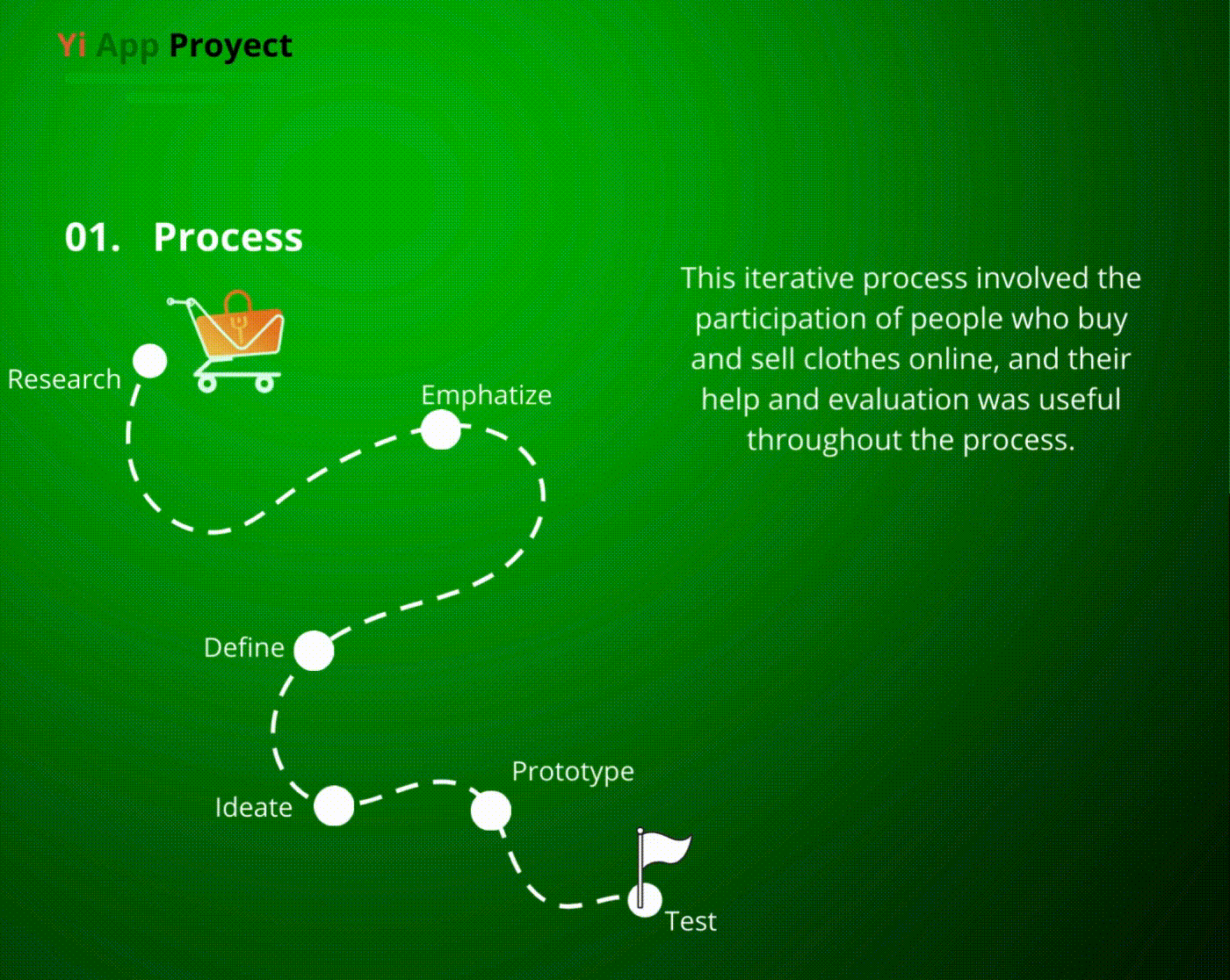

Research
What's the point of exploring this solution? Which user's interactions are involved? Let's see how common user behaviors and patterns can help to enforce these design concepts.
METHOD
- USER INTERVIEWS
- FIELD RESEARCH
Goals
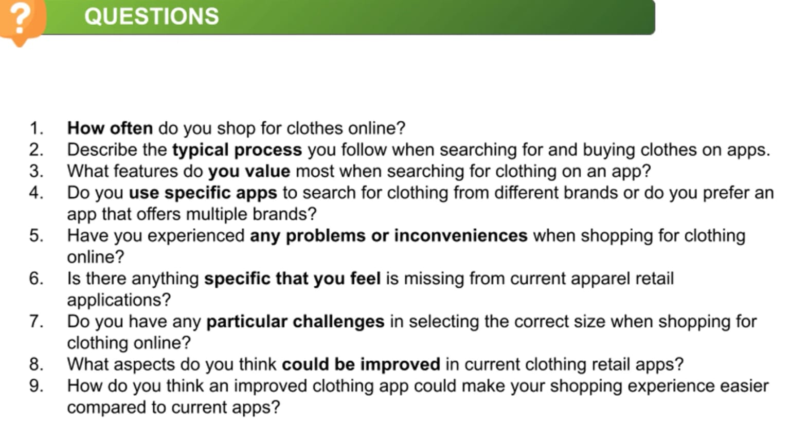
To understand the user's needs we conducted a user interview to identify their normal flow in an application, find out what problem they would like to solve and understand how an enhanced wearable application can help. With the research we tried to identify areas of opportunity to create in our application.
Result
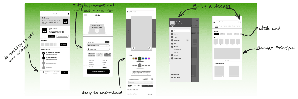
Thanks to that research we were able to identify the common path of a user to achieve their purchase objective. With the field research we were able to identify the areas of opportunity and from the result we came up with themes such as Multiple Addresses, Multiple Payment Methods and found that the whole multi-click checkout process could be simplified into a single view.
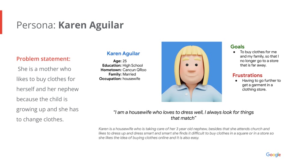
Persona Creation

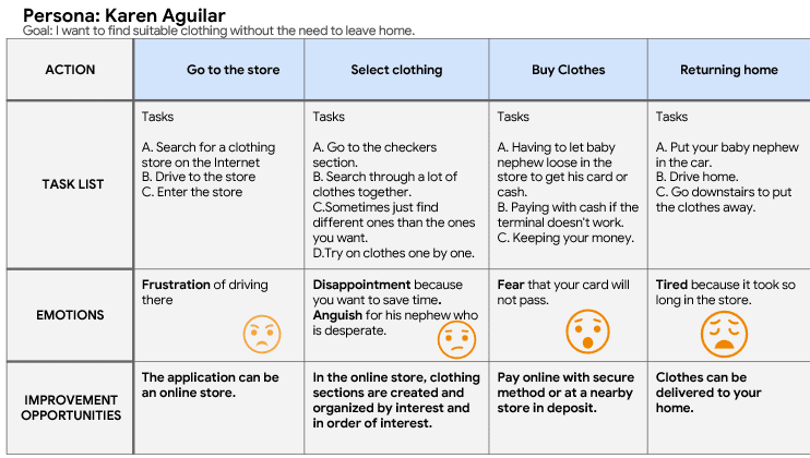
User Journey Map
To empathize with users, we also create empathy maps and a user journey map to delve into each stage our personas go through when buying a product.
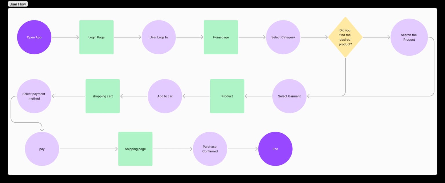
User Flow
To understand how we would build the experience we designed the main user flows for the Yi application, The user flow allowed us to see the whole application experience on a holistic level and thus make decisions
Architecture Design
Once we had gathered the topics and identified the user flows, it was time to start creating an architecture map of how the information would be organized in the design, we brainstormed ideas, separating what did not meet the objectives and saving it for future ideas.
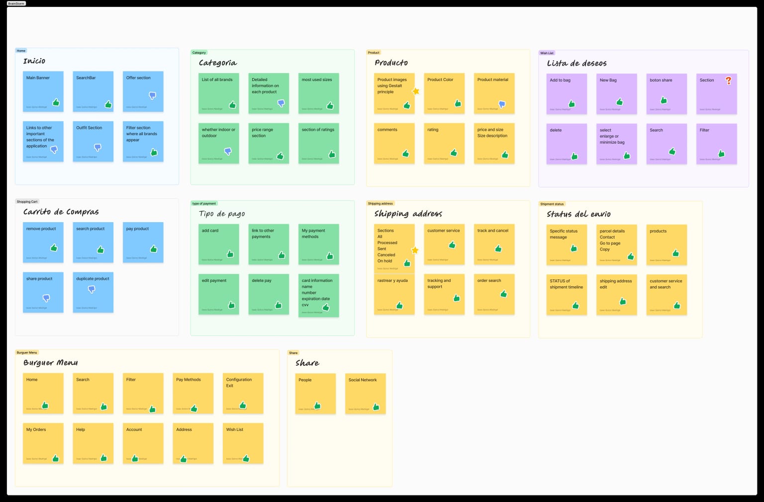
After the brainstorming we could clearly complete the information architecture by organizing each view according to its data, this also allows us to scale the application in the future and divide it into components making it easier to iterate and improve if required.

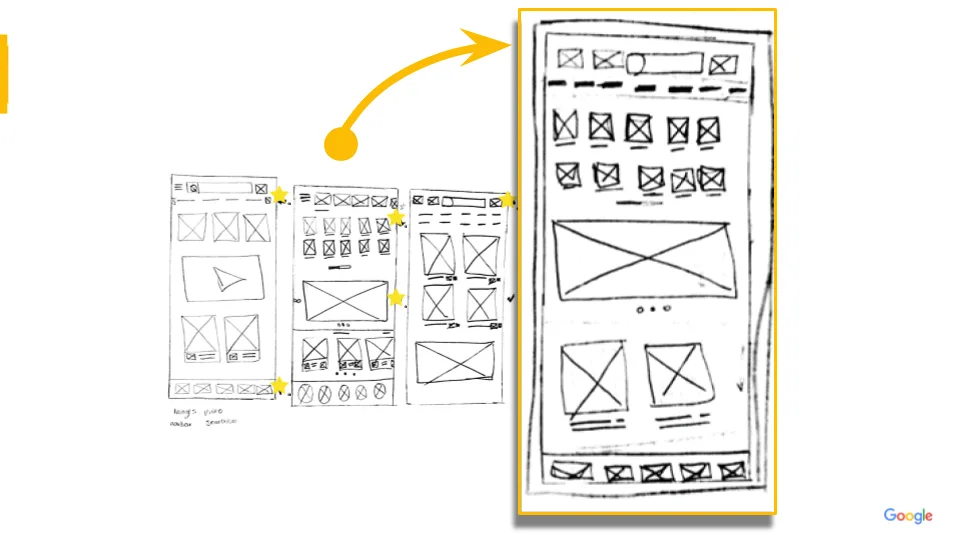
Crazy Eight
Once we had all the information ready and organized we started to create our mockups based on an exercise called "Crazy Eight" this helped us to extend the panorama of identifying different ways of views and based on that to choose a final design gathering elements from the other views evaluating simplicity, accessibility, inclusiveness and finally the design.
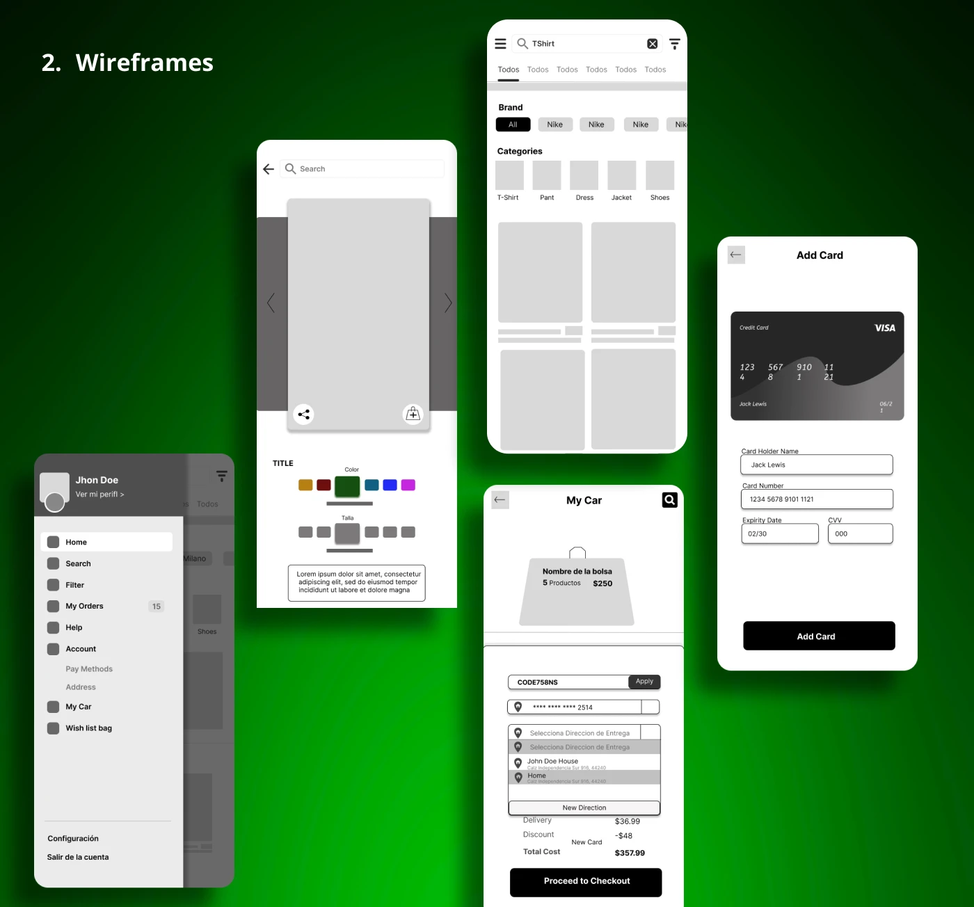
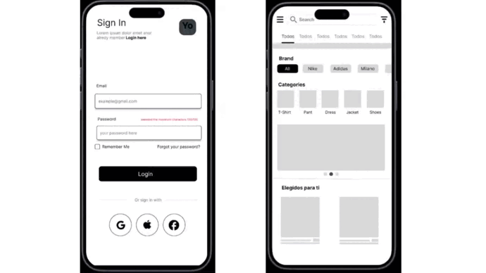
Wireframes
Iterating on the paper wireframes we started to create the digital wireframes, this helped us to identify real spaces within a device, it also clarified our ideas of where the final design was going, at this stage I learned that the elements must be understandable for all people and not just for me, so every thing that people didn't understand had a label.
Low Fidelity Prototype
After confirming our scenarios we started to put together some fundamentals of Yi, we wanted the user to choose their product and buy it, as if each step was a small part of the whole thing. The low fidelity wireframes helped us rule out some features that were not as fundamental as the shopping cart search.
Usability Testing Plan
We ran several participants through our low-fidelity prototype to better understand their patterns of interaction patterns. Each of them was given the simple task to buy a product. It wasn't the difficult task, but it was how they thought through the process of buying a product we were interested in.
📝 Design usability study survey
- ❓ Did you find it easy or difficult to buy a product? If your answer is very difficult or moderately difficult, what made it difficult for you
- ❓ If you could change anything about the process, what would you change?
- ❓ Did you find it easy or difficult to add the product to your wish list?
- ❓ I find it easy to navigate the application. KPI
- ❓ There are inconsistencies within the app. KPI
- ❓ I would imagine that most people would learn to use this app quickly. KPI
- ❓ I think I would use this app frequently. KPI
During the survey we learned that the user expected a deeper accessibility that translates into easy navigation and thanks to that we came up with themes and then the following solutions until we have solved the problem.
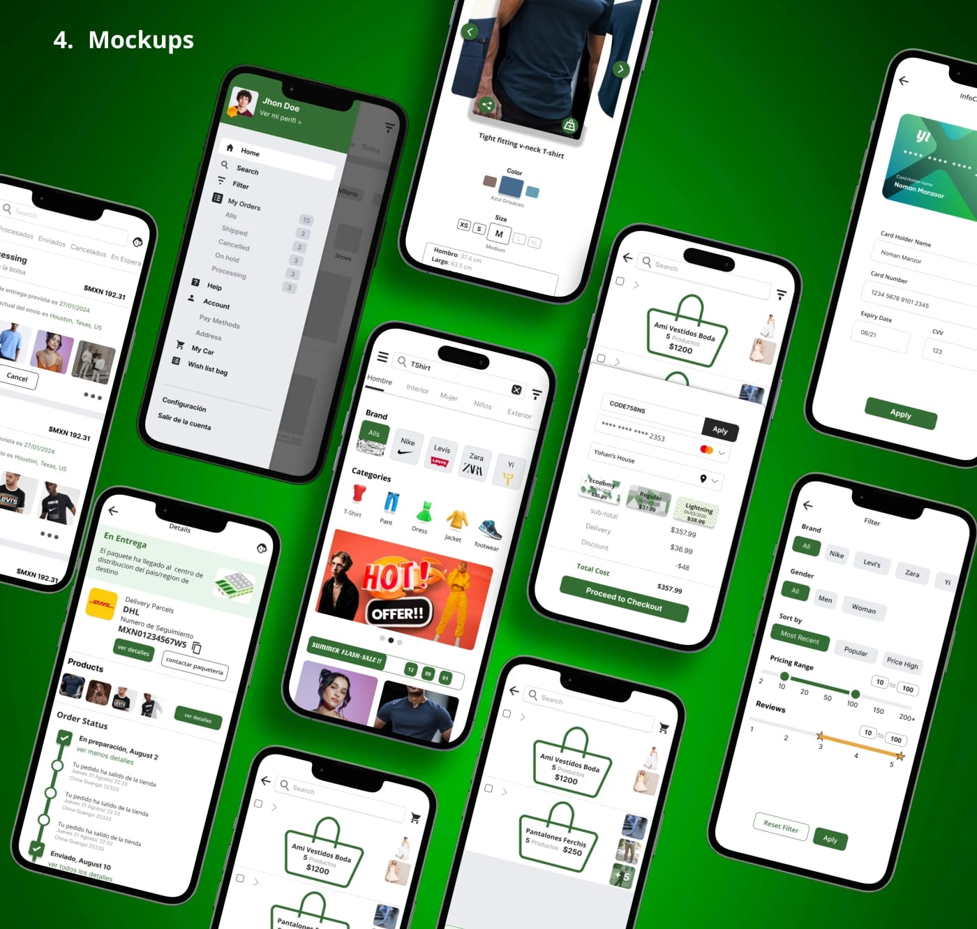
Mockups
After solidifying the foundational framework, we were able to take the feedback from our testing sessions and start to form our final comps. We used color sparingly throughout the product to help communicate interactable elements to the user and guide it sequentially to the main objective.
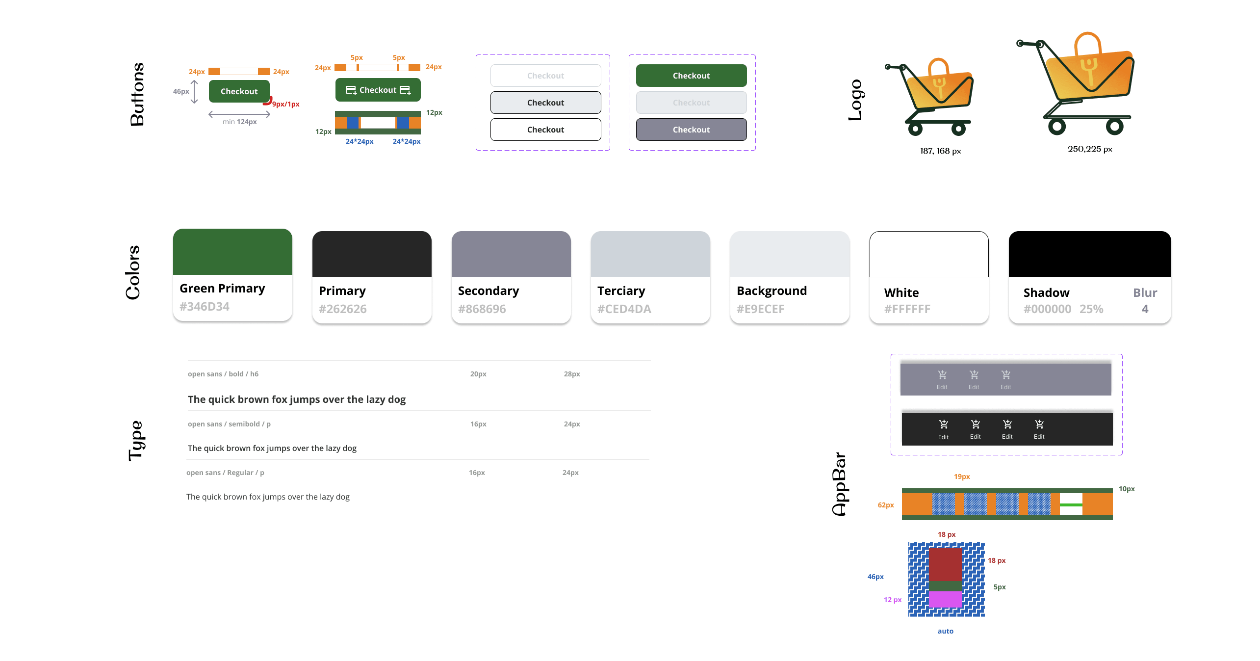
Design System
Creativity, Money and Freshness
The green color was selected to show creativity and innovation on each product that is sold, the semicircular corners represent fun but confidence by not being so circular.
The brand logo is a creation of two names Yohana Isaac, the bag in the cart is the identity of the brand as objectively the purchases in the application can be organized by bags and then add to cart but you can also add the products individually.
High Fidelity Prototype

Conclusion
Yi is a multi-brand, multi-payment, multi-shipping address, multi-packaging apparel retail app.